Survey Design

Bad Design = Bad Data = Bad Decisions

05/06/2020
 

Surveys are an effective method to gather information to assist with making decisions. Online surveys offer researchers the ability to inexpensively reach large numbers of respondents. Professional survey platforms (we use Survey Gizmo) provide a variety of robust tools and question types that greatly enhance the survey-taking experience.

Unfortunately, the proliferation of "free" survey platforms and survey tool integrations into apps like Constant Contact has led to excessive surveying and an abundance of poorly designed and poorly executed surveys.

A good example of this hit my inbox this week.

Sent by an outdoor goods retailer, the survey intended to get a finger on the pulse of their customers to better understand how the Coronavirus was affecting their outdoor plans this summer. They would likely use the results to help forecast sales in different categories and align messaging to be relevant to their customer's summer plans.

The survey set up and the message were on brand and they were generous with a $10 incentive for completing the short survey. A great start! Unfortunately, one of the first questions created what we describe as a survey speed bump. A question that slows down or stops the respondent as they work through the survey. These speed bumps are often the result of confusing, long-winded or otherwise poorly written questions and take focus away from the question at hand, and in some cases, cause people to drop the survey.

In this case, the survey did a nice job of setting up the question; it was straightforward and concise. The problem lay in the answer choices provided. (Example below)

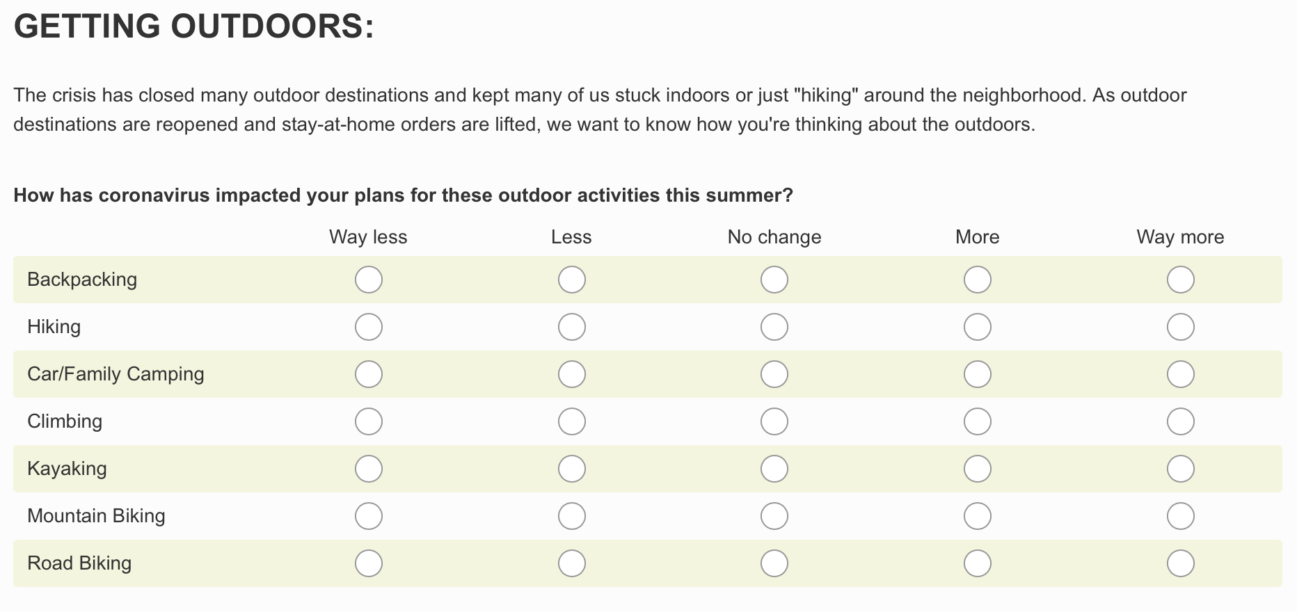


Survey Example


It seems straight-forward, right? Unfortunately, the survey designer failed to consider the very likely possibility that some of their respondents may not participate in the activities listed. If, for example, the respondent was not a climber or road biker, how should they respond? Do they leave that row unanswered? Do they select "no change"? The instructions did not provide any guidance.

This oversight made the question confusing, and beyond the concerns mentioned above, calls into question the validity of the data gathered. Imagine if only 10% of respondents are climbers and they all choose "Way more", but the other 90% were confused about how to answer and chose the "no change" option. The retailer would miss an opportunity to better serve this audience.

Fortunately, there are two easy ways to address this issue.

Option One is to provide clear and specific directions regarding how to answer the question. In this case, simply instructing the respondent to skip that answer if they do not participate in the activity would have helped. The downside is that it adds more copy to read, which lengthens the survey. Another concern is that some respondents may think they know what to do and not read the directions. A good survey question should not require a lot of explanation. Unless you have a meaningful relationship with the respondent audience, assume people will zip through your survey. It should be clear what to do at a glance.

Option Two is to provide an N/A (Do not participate in this activity) option in the far right column. This option provides several benefits. First, it is simple and straightforward, does not require explanation, and won't slow down response times. Additionally, it provides more detailed and robust data. In this case, it would not only offer a view into the expected behaviors of those who participate in that activity but also provide the retailer with a snapshot of what percent of their customers actually do that activity. Two types of valuable information from one question!

Good survey design involves putting yourself into the shoes of the respondent and considering all the possible ways they might respond. It requires that you are clear about what you are asking them to do. Remove uncertainty around how they are expected to answer and you will also remove uncertainty around the validity and usefulness of the data. And in turn, you will make better, more confident decisions.

Jeff Hyde
Jeff Hyde
Managing Director

Tips and resources delivered to your inbox.

* indicates required